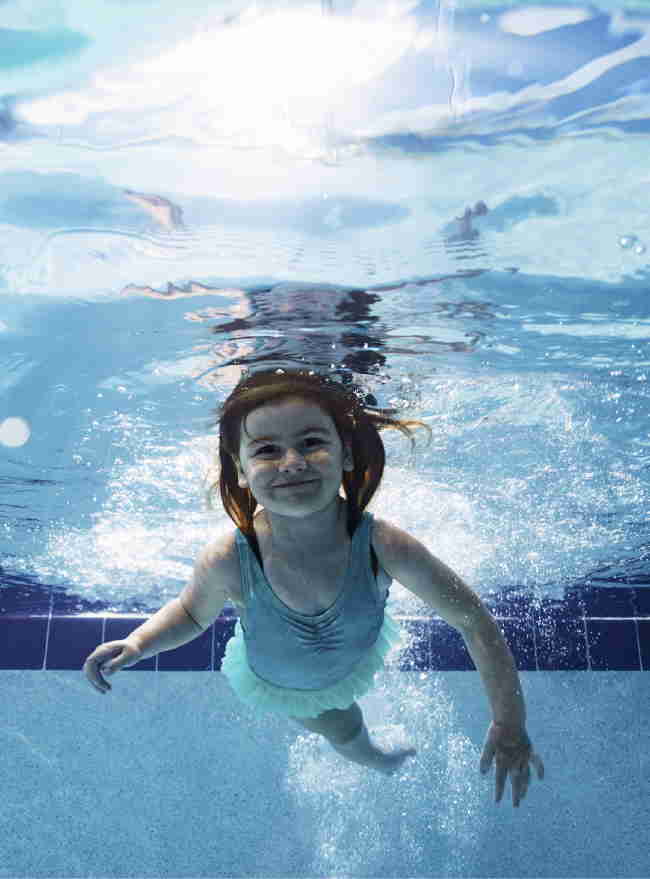
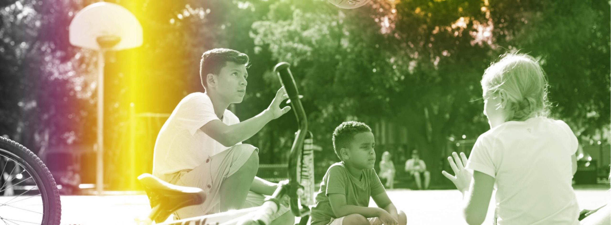
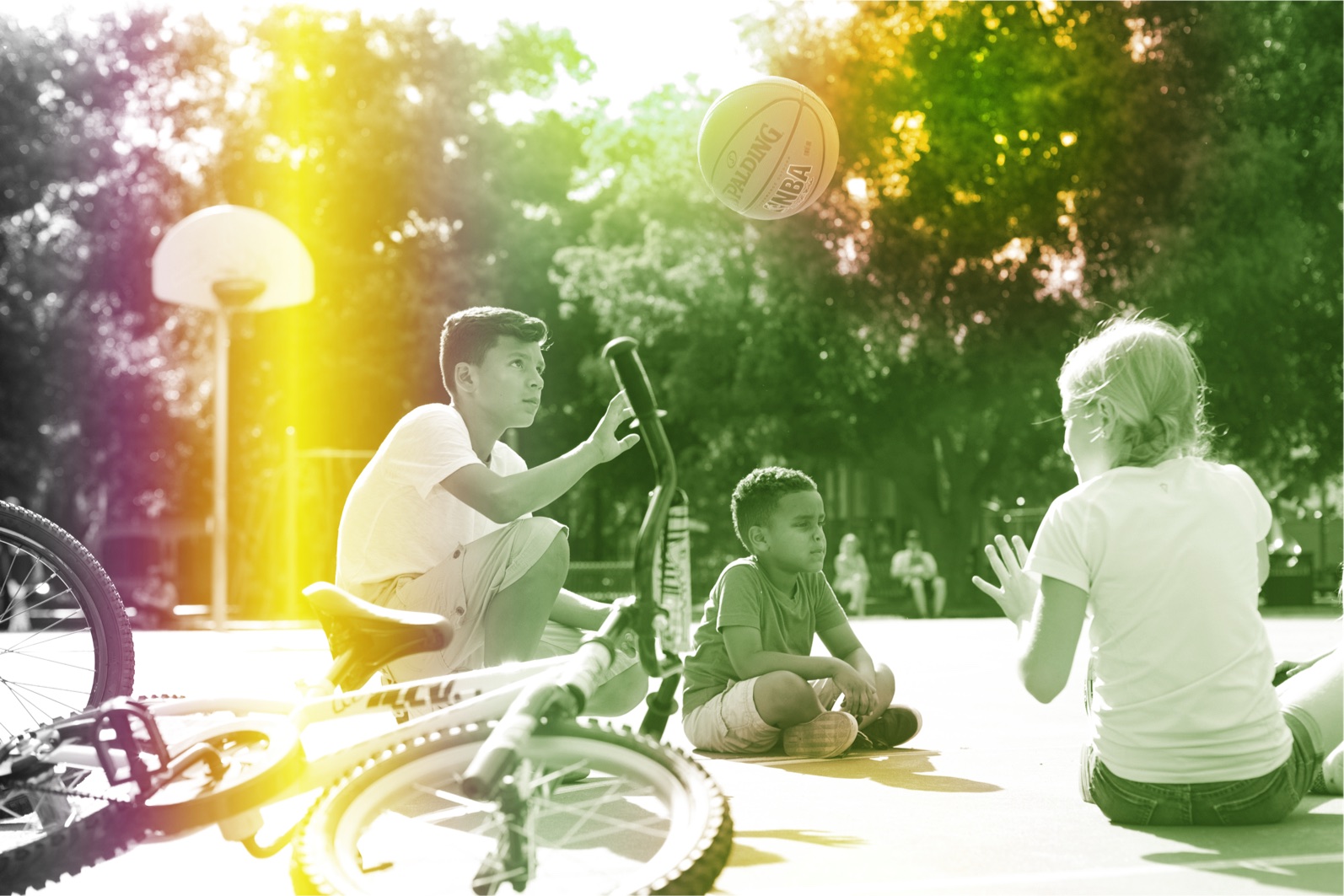
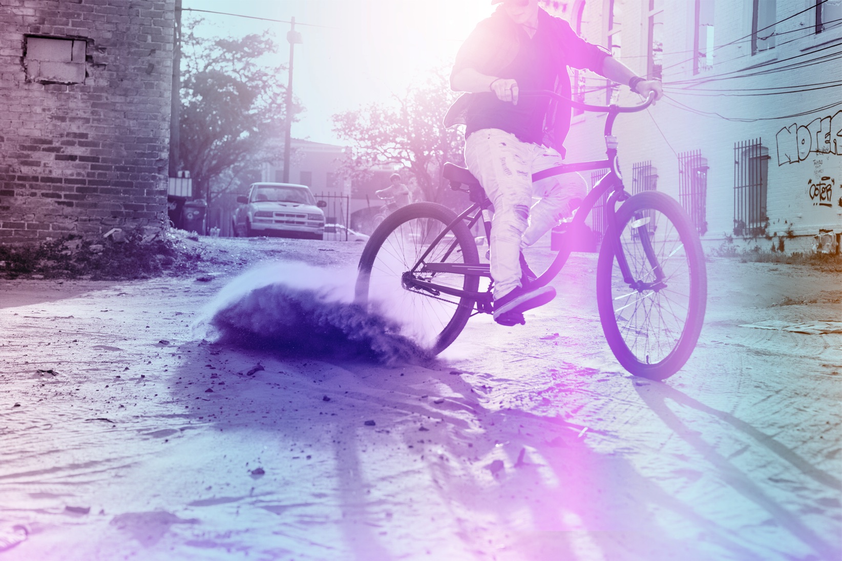
Photography consists of natural shots, captured in-the-moment. They’re candid, authentic, and captures a pure moment with children playing and exploring both in the urban landscape and lost in nature.
Background
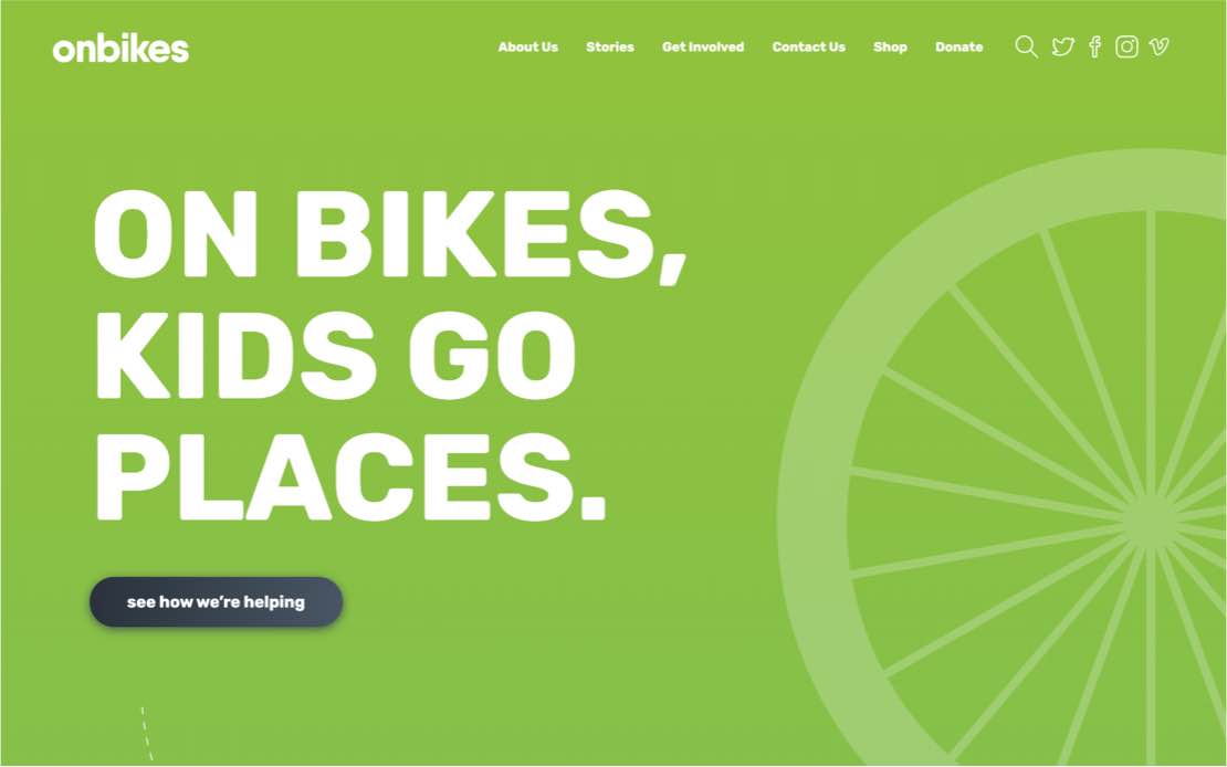
OnBikes is the non-profit organization that brings together corporations, neighborhoods, and individuals to build high-quality bikes and give them to kids-in-need in their communities with the help of community partners, so every child can experience the best parts of childhood—no matter what circumstances they live in.
-
Client
OnBikes
-
Years
2019
-
Industry
Nonprofit
-
Services
Interface Design
Performance Optimization
User Experience Design
Website Development
Challenges
onbikes had personality, multiple.
Our challenge was to take the branding for each event and create a corporate identity.
Solution
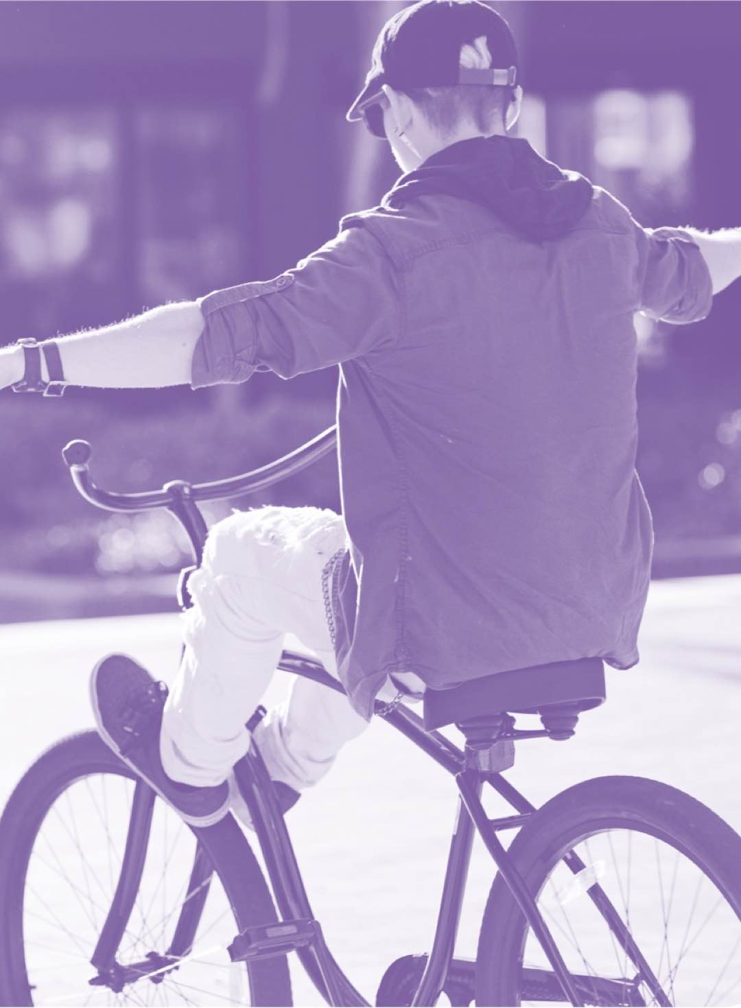
They start shaky. Lots of wobbling and falling. But with each new day, their confidence grows.
-
Mission
OnBikes improves the lives of at-risk children by giving them bicycles, so they can learn, grow, and experience a moment of freedom— ultimately building strong, confident kids and communities.
-
Vision
A world where every child has their very own bike so they can enjoy the freedom of being a kid.
-
Positioning
OnBikes is the non-profit organization that brings together corporations, neighborhoods, and individuals to build high-quality bikes and give them to kids-in-need in their communities with the help of community partners, so every child can experience the best parts of childhood—no matter what circumstances they live in.
Messaging
-

Riding a bike makes healthy kids. And healthy communities.
It’s freedom. Responsibility. A chance to explore. Not to mention exercise. Which keeps kids healthy. And brings communities together.
-

Some kids never get a chance to own—or even ride—a bike.
Some families can’t afford to give their child a bike. In fact, in some neighborhoods only half the kids have access to a working bike.
-

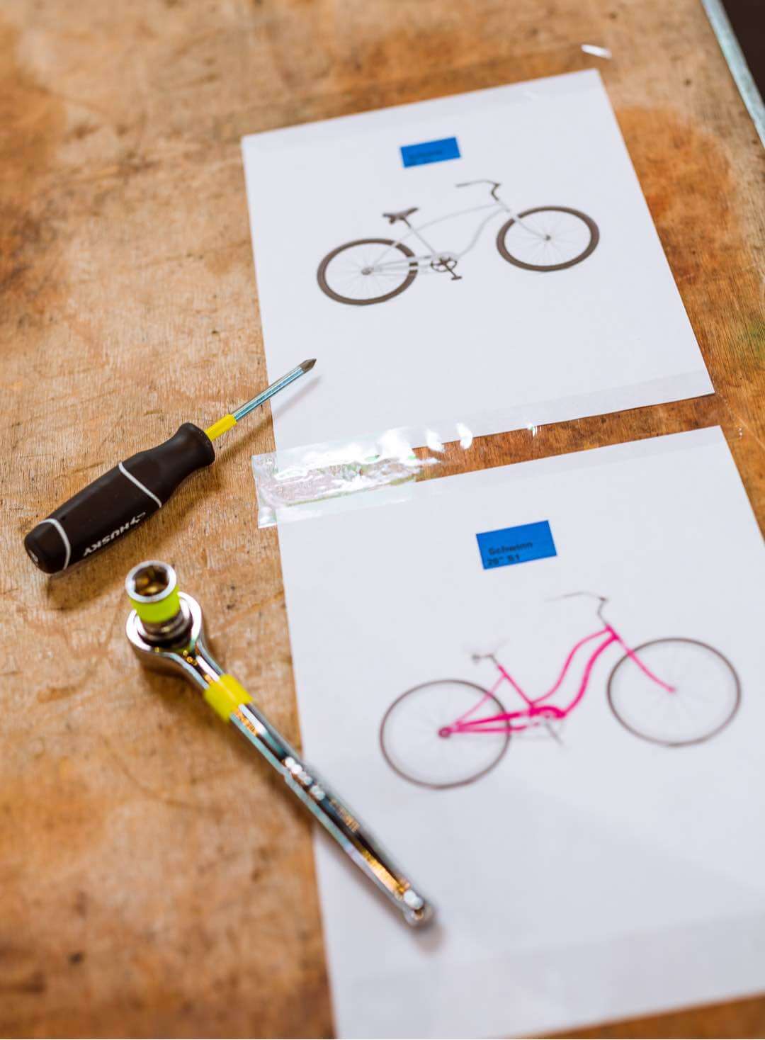
We bring people together to build and give out high-quality bikes.
High-quality bikes stand up to kids being kids. And we give them to kids in your own community, by working with community partners who know where they’re needed most.
logo
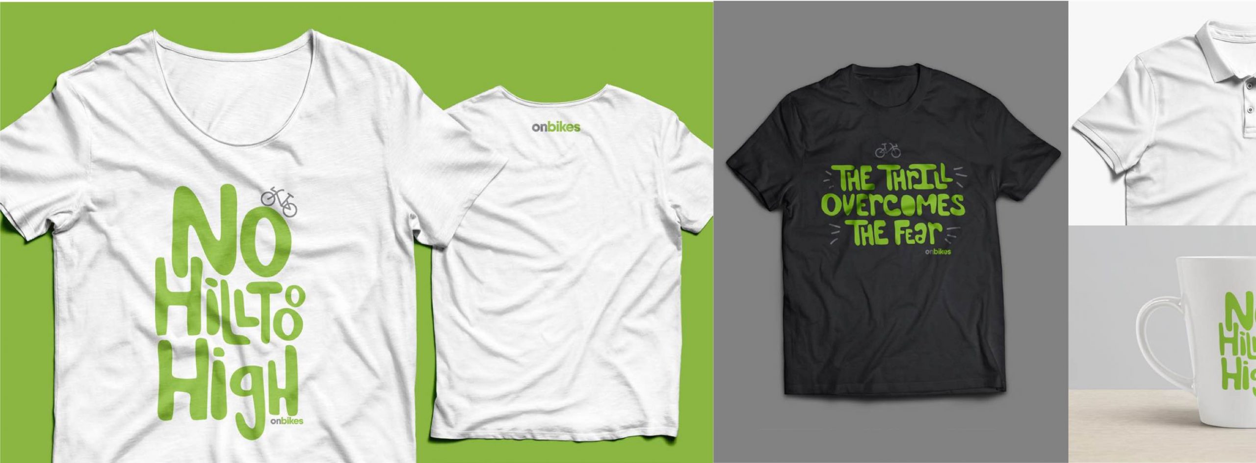
The logo is built from two elements: a logotype and a logomark. The logotype is a typeface, and the logomark is a visual mneumonic. For OnBikes, the logotype has been updated to reflect a fun, modern, professional look, that when paired with the logomark becomes a standout event logo.

color
By using primary and secondary colors, photos can be treated to add consistency and give a rugged, captured-by-hand feel to the photography. While not necessary for every photo, the treatment does bring together disparate photos under one consistent brand feel.
Typography
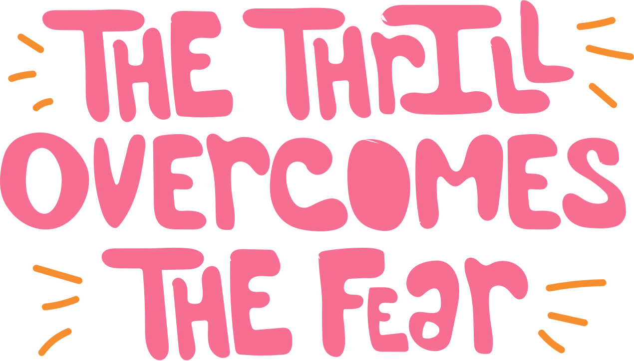
We designed an organic, custom font using a mix of full and thick shapes to create the typeface. Letters are designed to vary with the use of upper and lowercase based on the space available. This font is used for headlines in ads or creative that capture the youthful, free spirit of the brand.
Photography
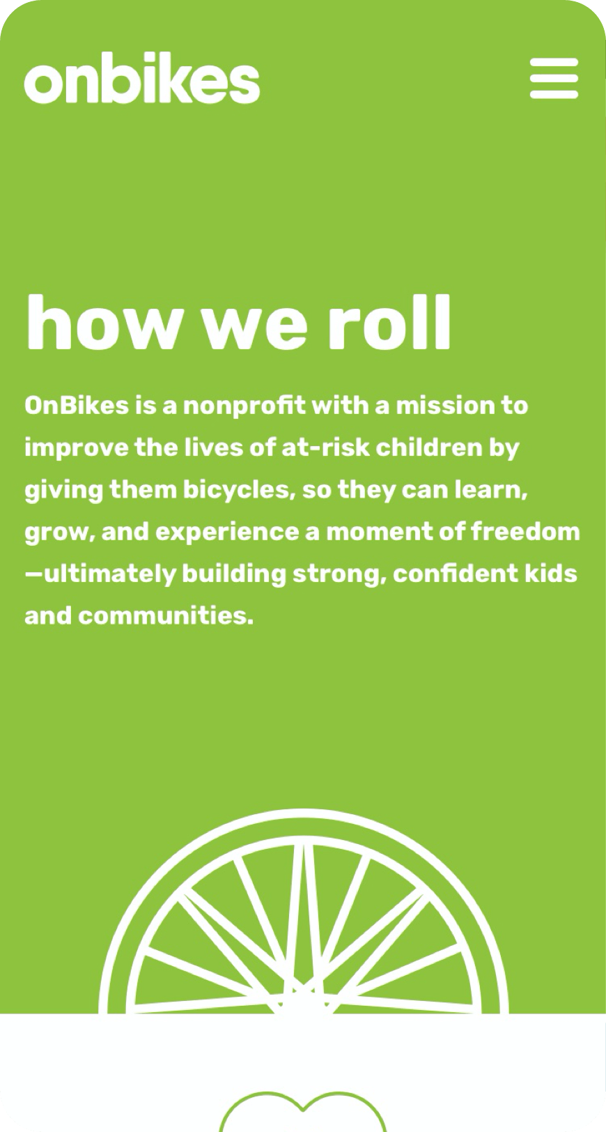
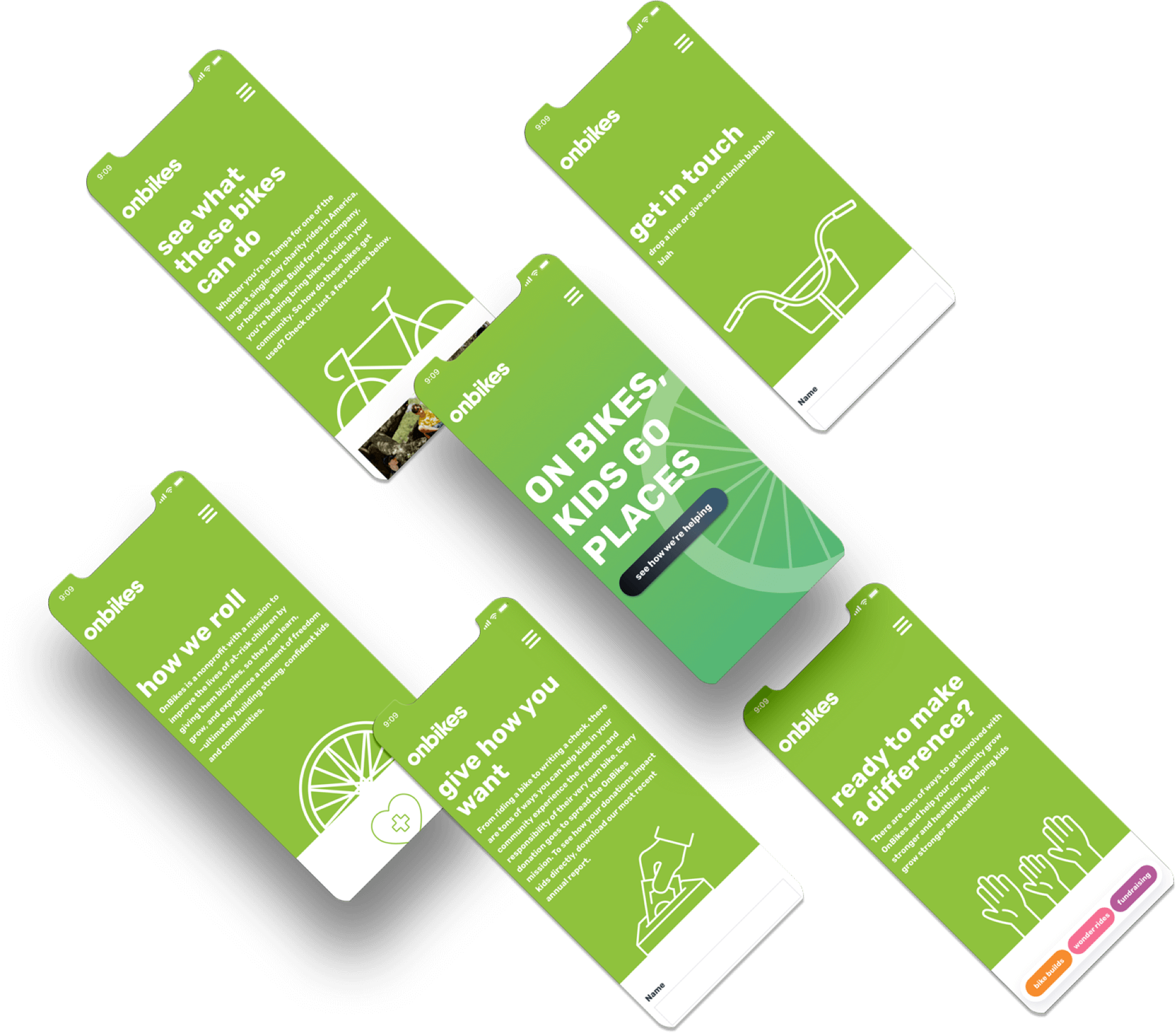
Website
We curated the new branding and messaging across all platforms, including a website refresh.